Scroll to begin
Our logo is the most visible and accessible element of our identity. The Punta Este logo should appear in its 2-color version whenever possible. The integrity of the logo must be respected at all times. Never recreate or modify in any way.
In single-color applications either the dark blue Pantone 289 U or a solid black color should be used.
In instances where the background is a dark or solid color, the logo can be reversed as shown.
In single-color applications either the dark blue Pantone 289 U or a solid black color should be used.
In order to maintain the integrity of the logo, it is important to allow a specified amount of padding around it. The minimum clear space is measured by double the width and height of the ‘P’ letterform taken from the word mark text. Additionally, for readability the logo should never appear smaller than the following sizes below.
The tagline can be paired with the logo or live independently from it.
The typography is an important element within the Punta Este visual system. It ties our messaging together and maintains a cohesive familiarity. Our main brand typeface is Gotham used primarily in four weights: Light, Book, Medium, and Bold. For email communications Arial is an acceptable substitution.
Gotham Light
Gotham Book
Gotham Medium
Gotham Bold
Arial Regular
Arial Bold
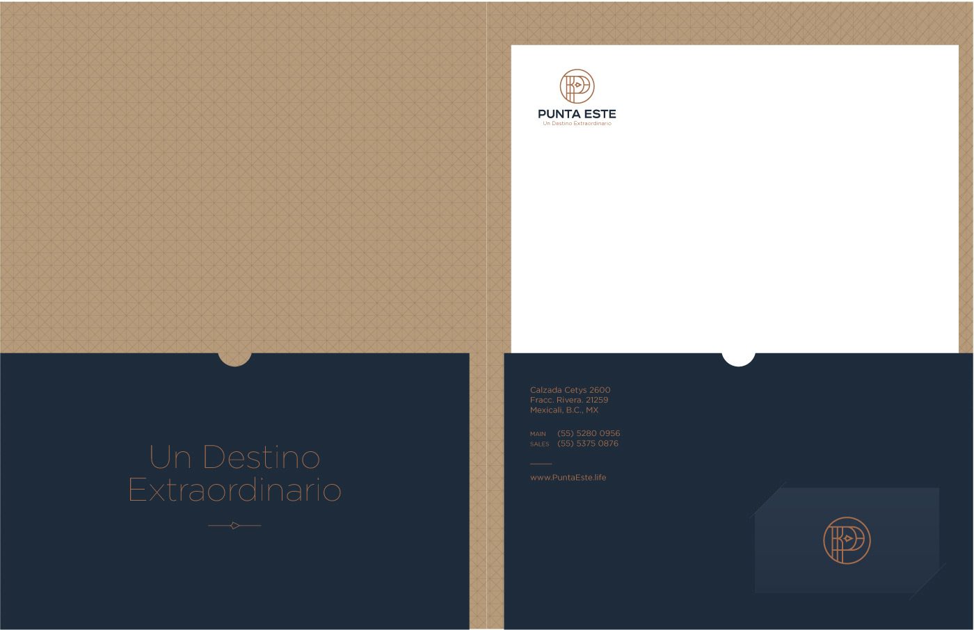
The pattern serves as a background textural element to add layered visual interest. It should be used sparingly and not over-power the piece or become a primary focal point.
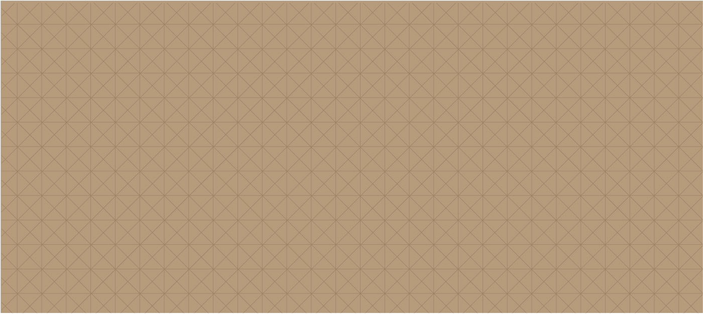
The pattern contrast with the background color should be low and subtle.
Transparency: Multiply
Opacity: 25%
The scale of the pattern should remain fine and complex with high density. Do not thicken the stroke weights or scale the pattern sizes disproportionately large.
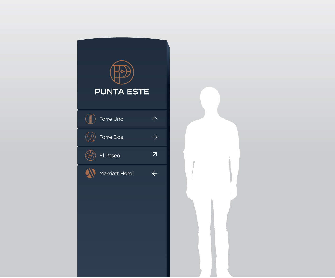
Our icons echo the same architectural lines from the ‘P’ image mark seen within the Punta Este logo. When creating new icons, it is important to maintain the same consistent single line weight, with close attention to detail. When icons are encircled, they should be cropped along the bottom for visual consistency.